
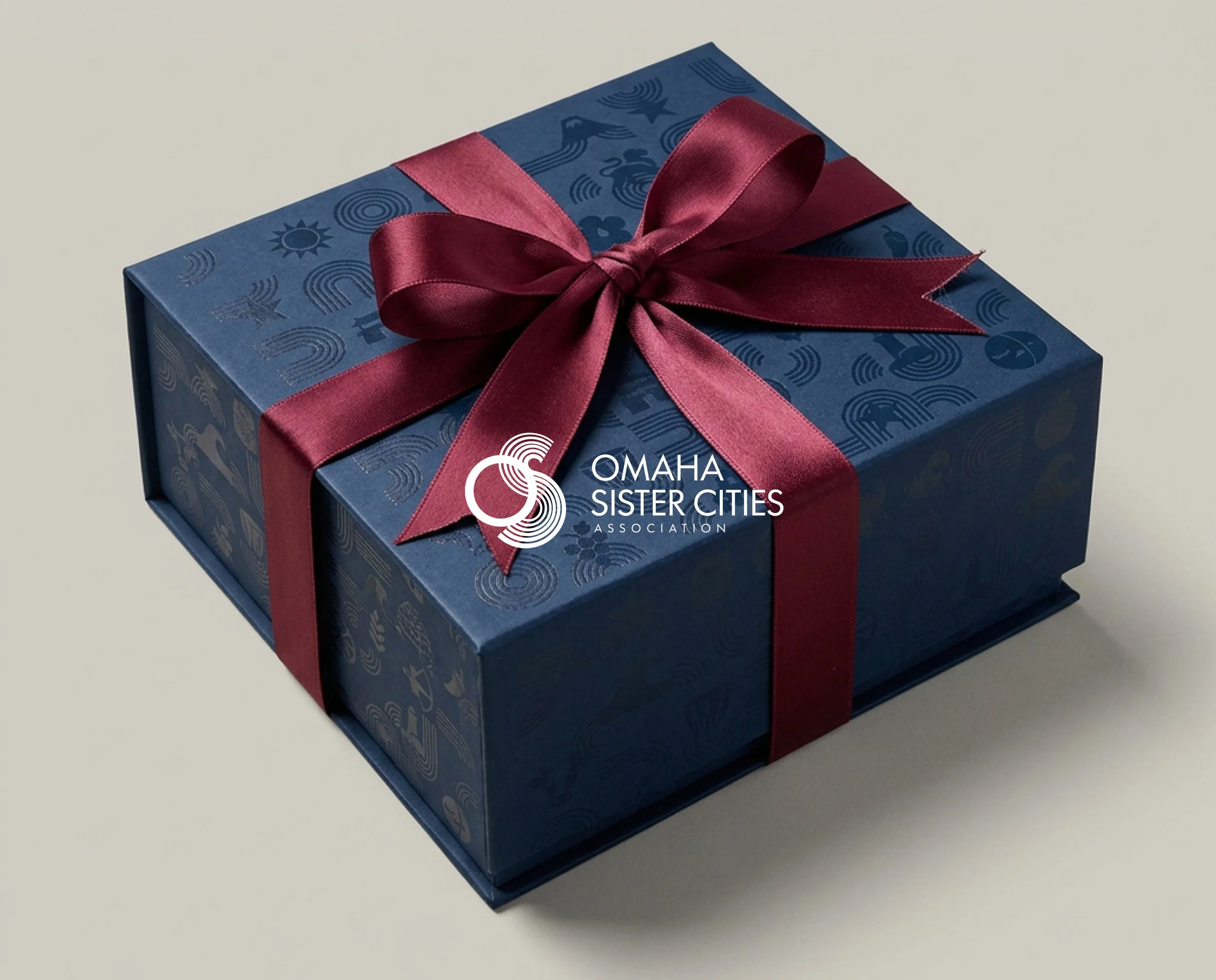
Bringing Warmth & Consistency to 60 Years of Global Friendship with Omaha and the World
Omaha Sister Cities Association
Brand Strategy | Visual Identity | Brand Guidelines | Nonprofit
2025- 2026 Ongoing
BRAND STRATEGY · BRAND GUIDELINES · VISUAL SYSTEM DESIGN · ART DIRECTION
Role
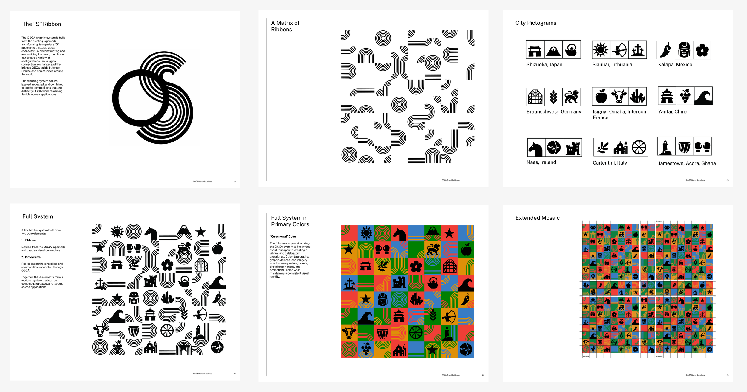
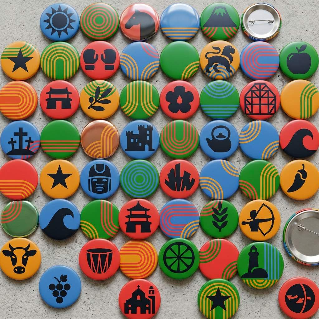
I led brand strategy and authored the full guideline set — pillars, color, typography, the graphic device system, illustration direction, photography direction, and layout principles — building from OSCA's existing logomark rather than replacing it. As a volunteer-driven organization with a long history, OSCA needed a system people could pick up and use consistently without starting from scratch on every project, and one that honored what the organization had already built rather than discarding it. I designed the ribbon-to-mosaic system myself, along with 27 pictograms, representing OSCA's partner cities, 3 for each of the 9.
Overview
For more than sixty years, the Omaha Sister Cities Association has connected Omaha to nine partner cities around the world through cultural exchange, education, and civic partnership. OSCA had built real recognition abroad and with civic leadership — diplomatic visits, formal exchanges, program relationships that worked. What it hadn't built was recognition at home: members described an organization well known internationally but largely invisible to the Omaha community it's rooted in, especially to younger residents who had never encountered it at all. The brief was to close that gap — a brand strategy and visual system that could hold both ends of that range at once, dignified enough for diplomatic and civic contexts, warm and approachable enough to introduce OSCA and its nine sister cities to an Omaha audience meeting it for the first time.
I.
II.
Outcome
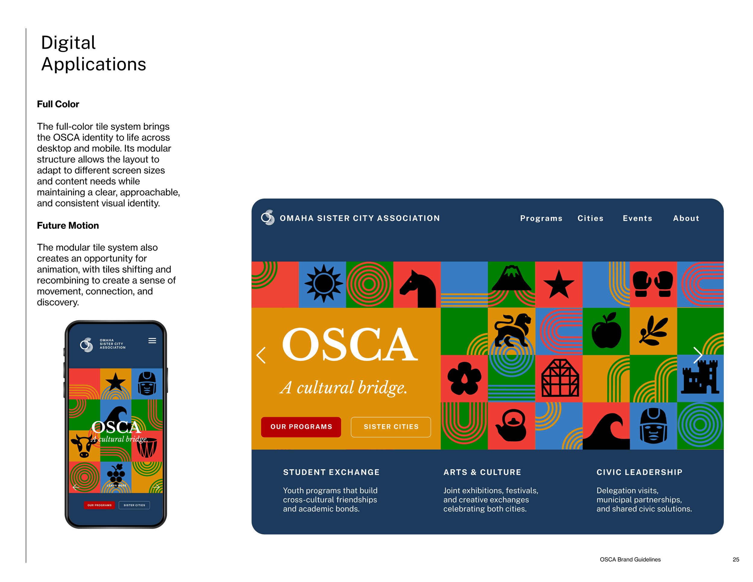
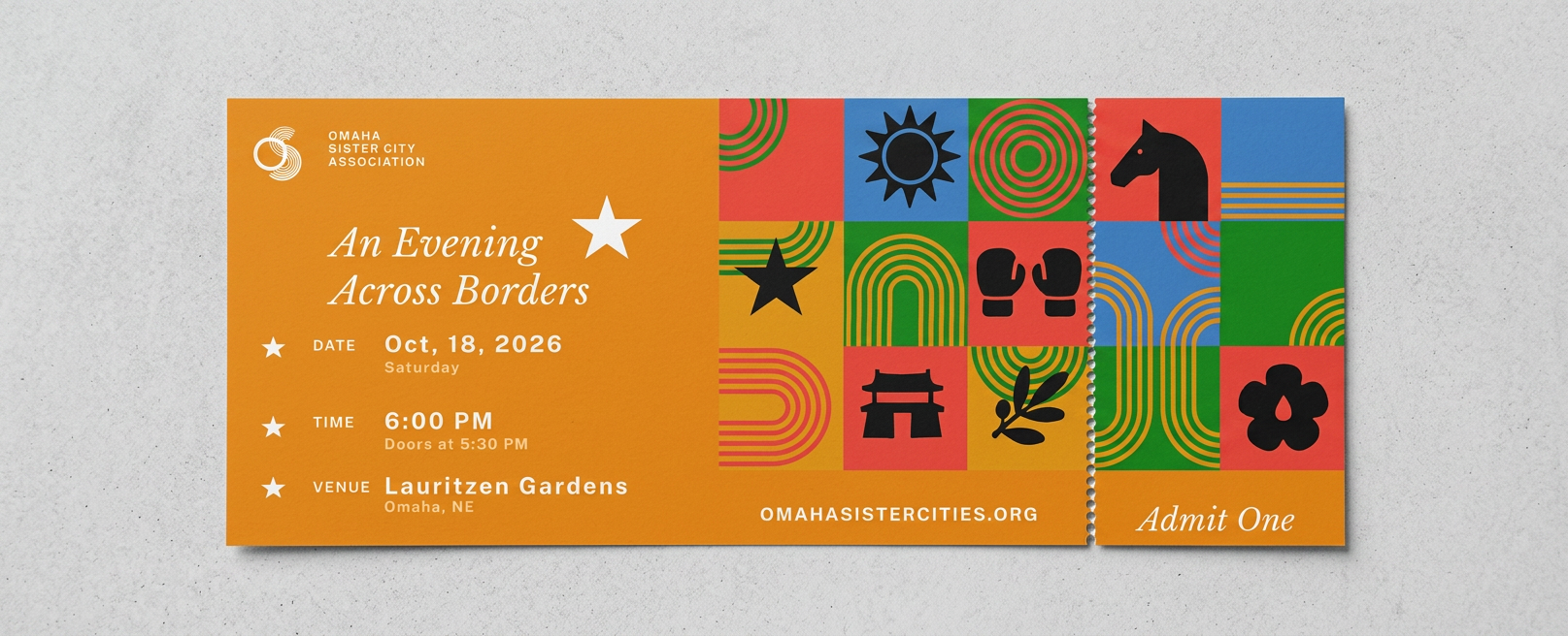
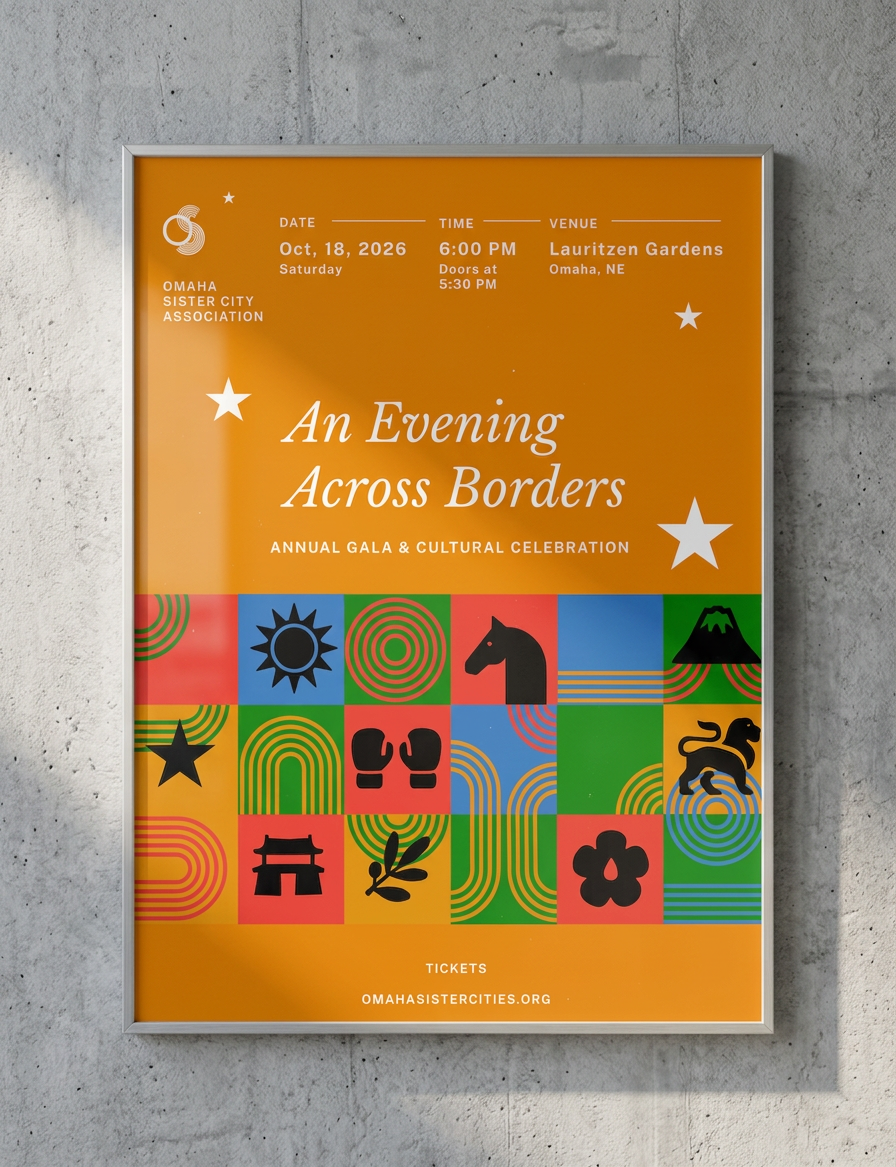
The finished system holds two registers at once: bright, primary-color applications built to feel warm and immediate for local programming, events, and the kind of first encounter a younger Omaha audience might have with OSCA — and a quieter, more restrained palette, Civic Navy and Exchange Red with embossing and tactile paper stock, for donor gifts, membership materials, and diplomatic occasions. The same tile system that opens into a full-color mosaic of 27 pictograms for a community festival can close into a foil-stamped gift box for a visiting official. It's a toolkit a volunteer-driven team can pick up and use consistently, built to do the thing OSCA most needed: make an organization with real international standing feel just as present, and just as welcoming, at home.
III.
Brand Strategy
OSCA's mission, vision, positioning, and motto establish a shared foundation — an organization that builds partnerships between Omaha and communities worldwide through cultural exchange, education, and civic collaboration. Five pillars — Connection, Understanding, Exchange, Collaboration, and Cultural Bridge — translate that foundation into practice, framing OSCA not as a broadcaster but as a connector: the throughline from building relationships to sustaining them.
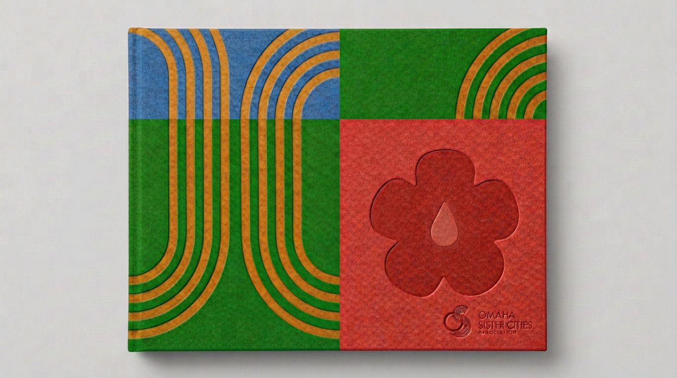
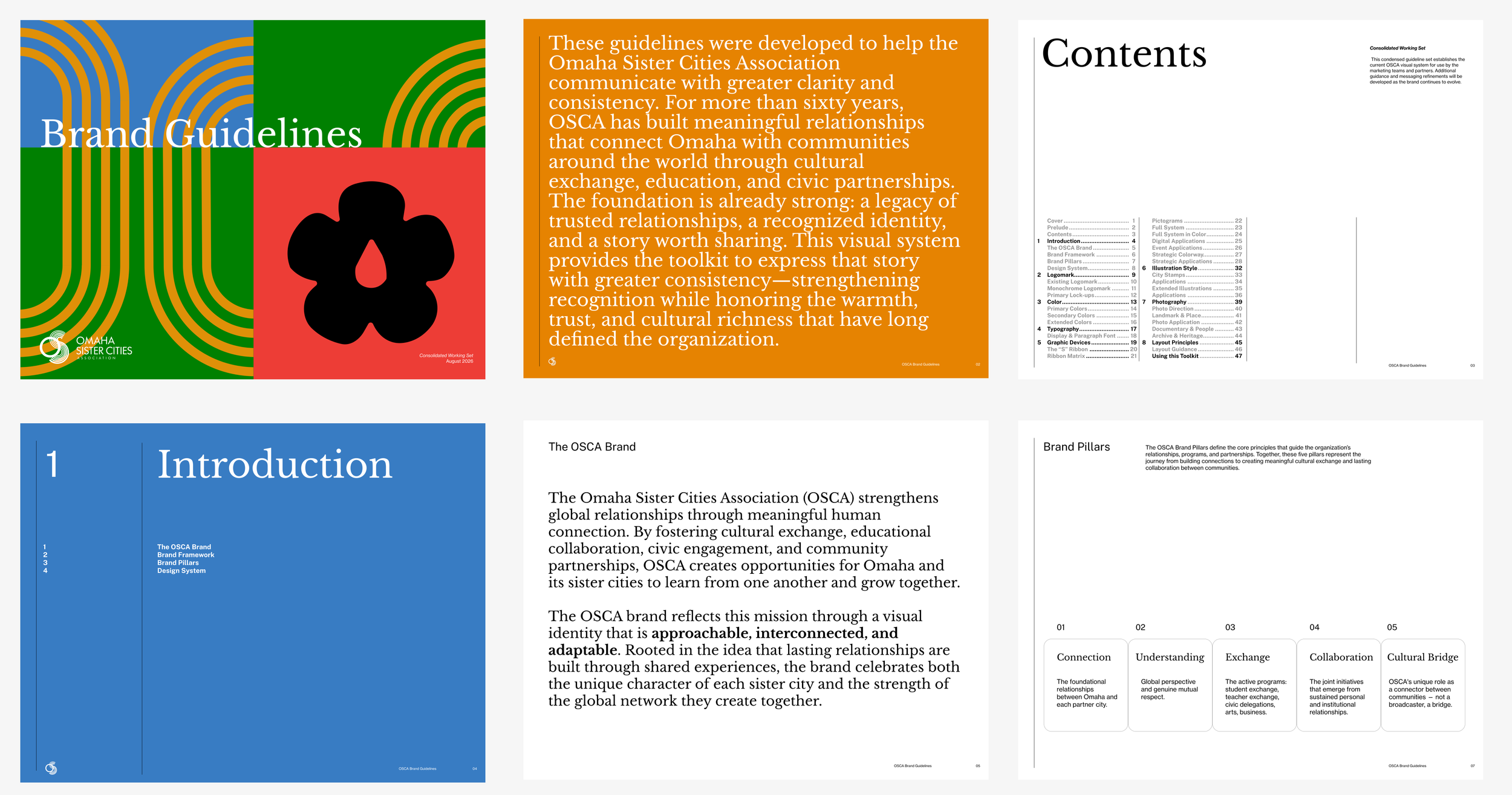
Existing Logomark

Visual System
The system starts with the one asset OSCA already owned: the "S" ribbon in its existing logomark, deconstructed into a flexible connector that can be layered, repeated, and recombined. Paired with nine pictograms representing OSCA's partner cities, the ribbon and icons form a modular tile system — compressible to a single mark, or expanded into a full field pattern across digital, print, and event applications.
Strategic Colorways
Color is used with intention, not applied uniformly. Focused colorways let the same graphic system shift register — brighter and more energetic for public programming, quieter and more restrained for donor, membership, and leadership contexts — so one visual language can speak in more than one voice without losing coherence.
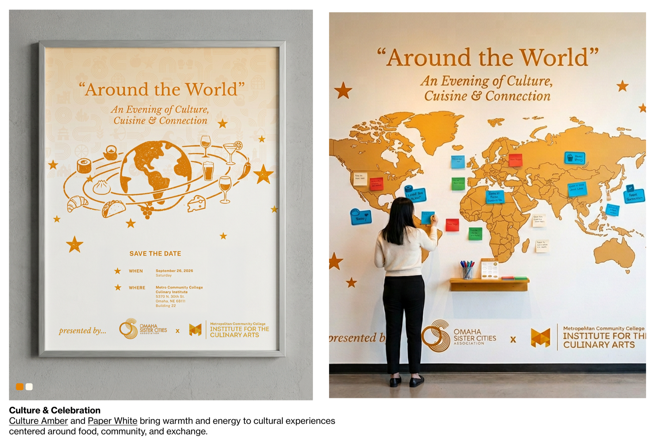
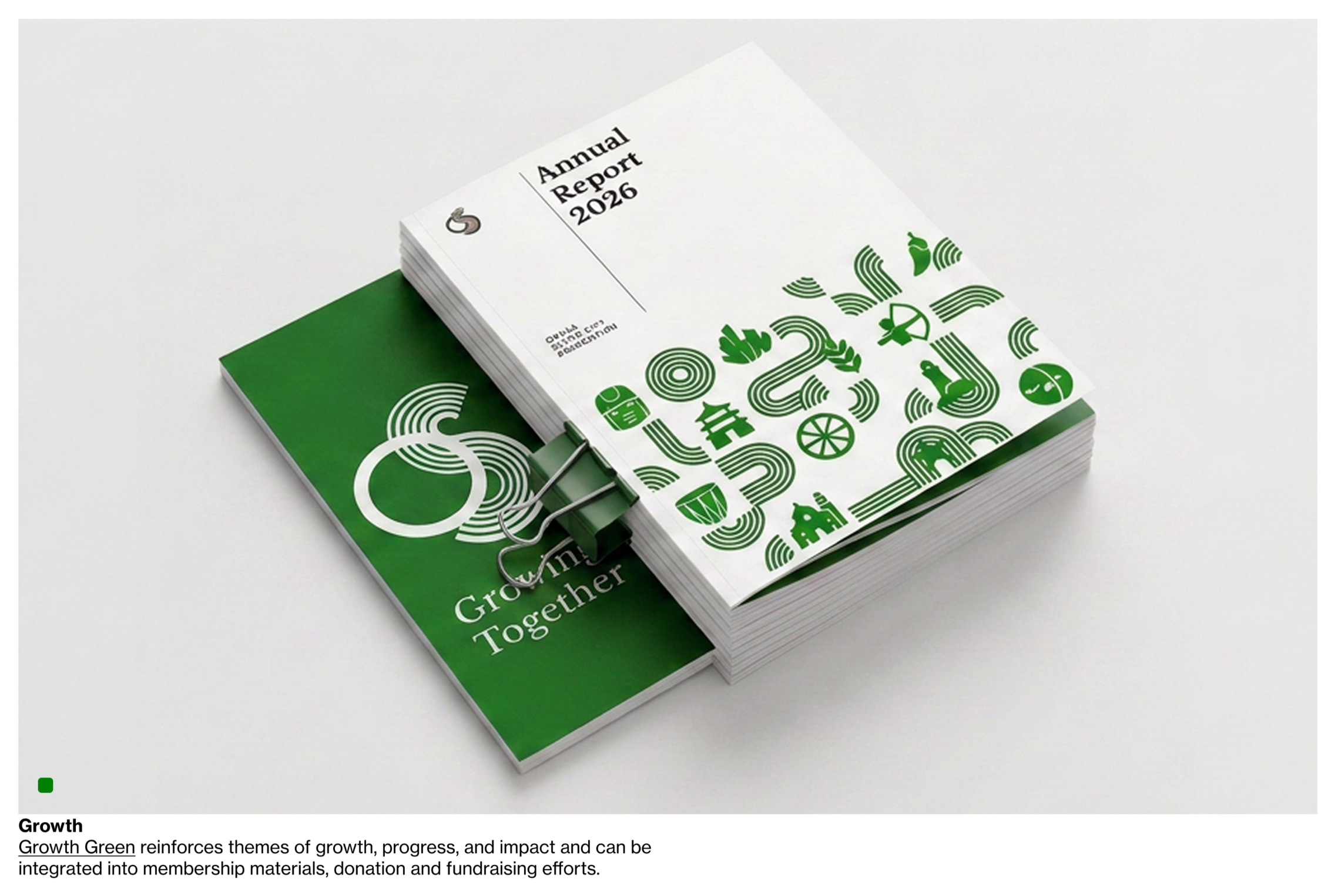
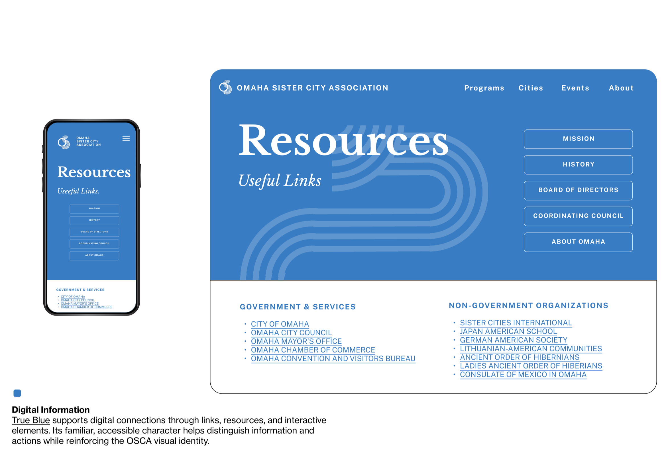
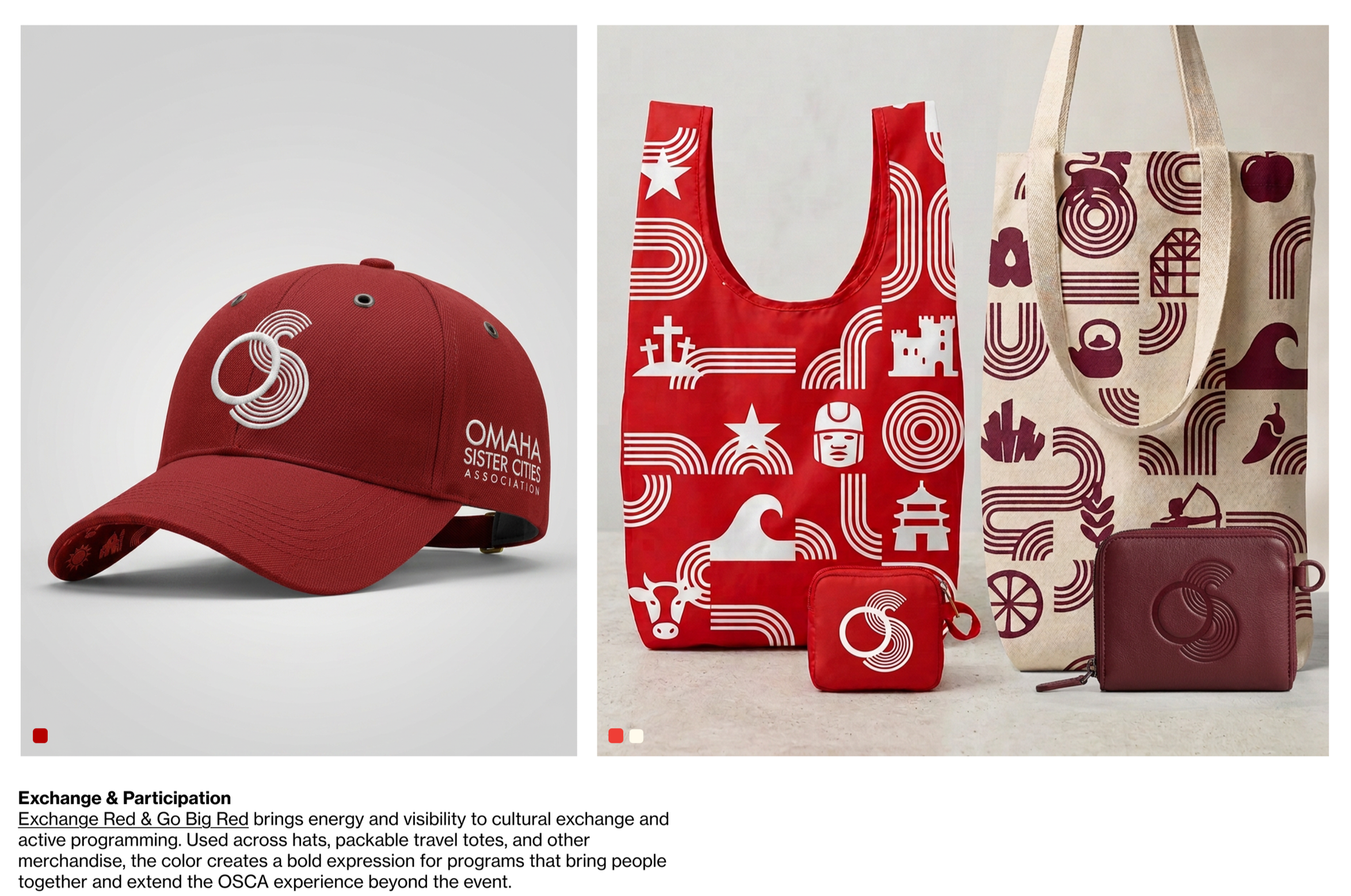
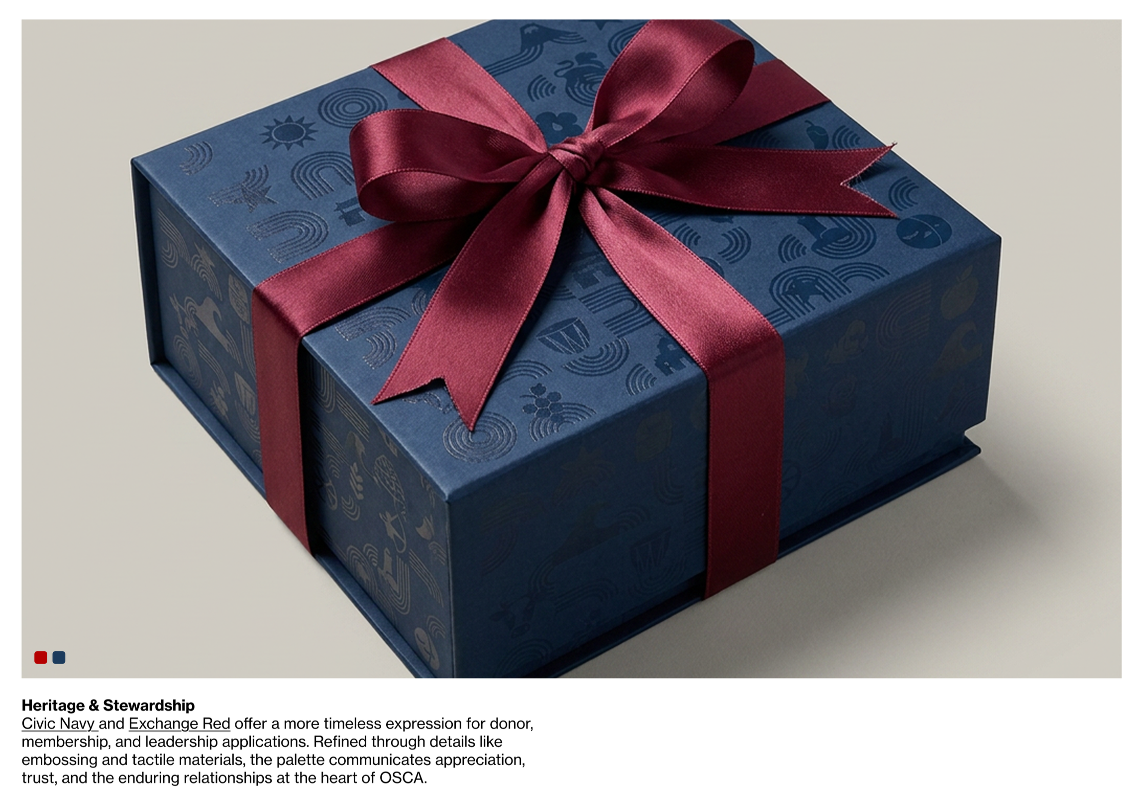
Illustration Style
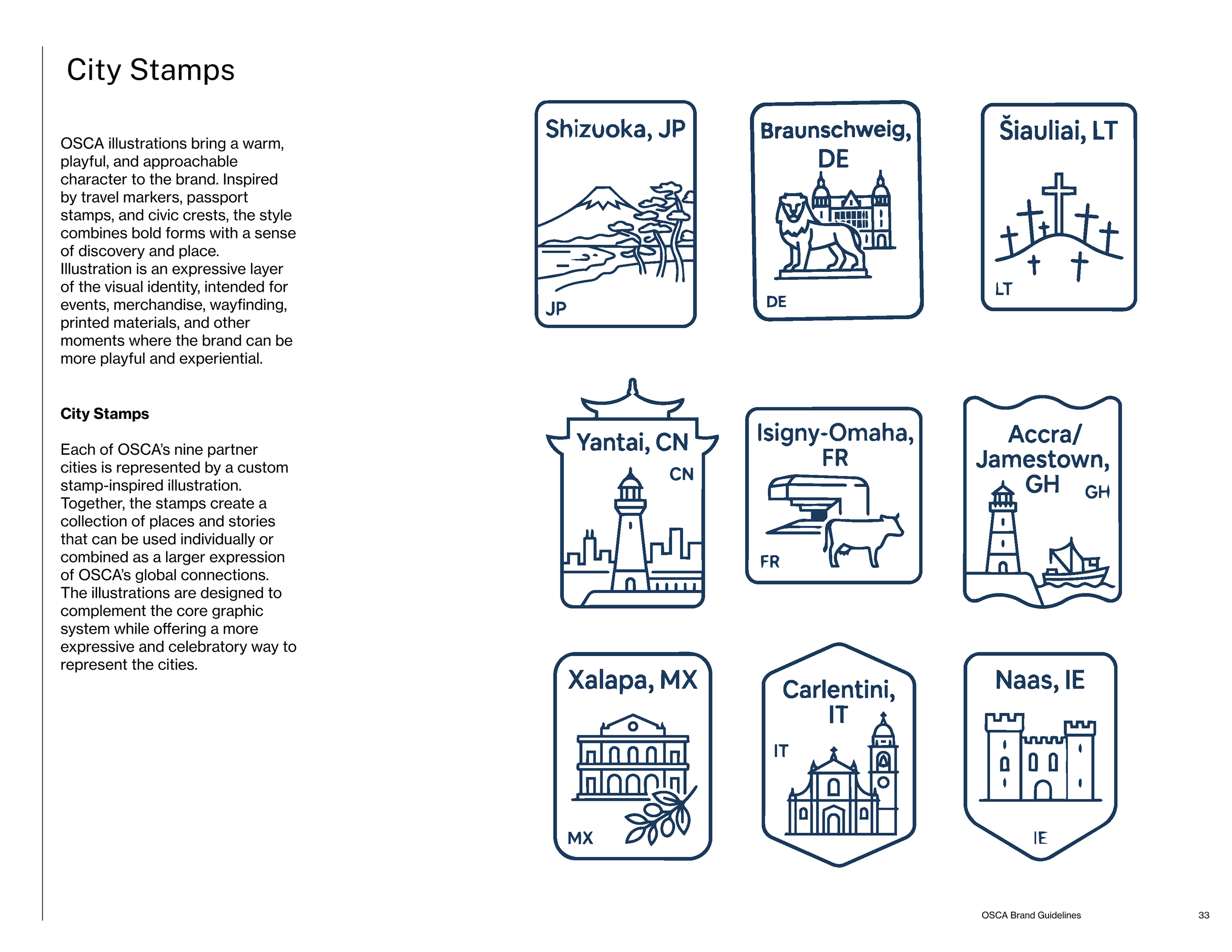
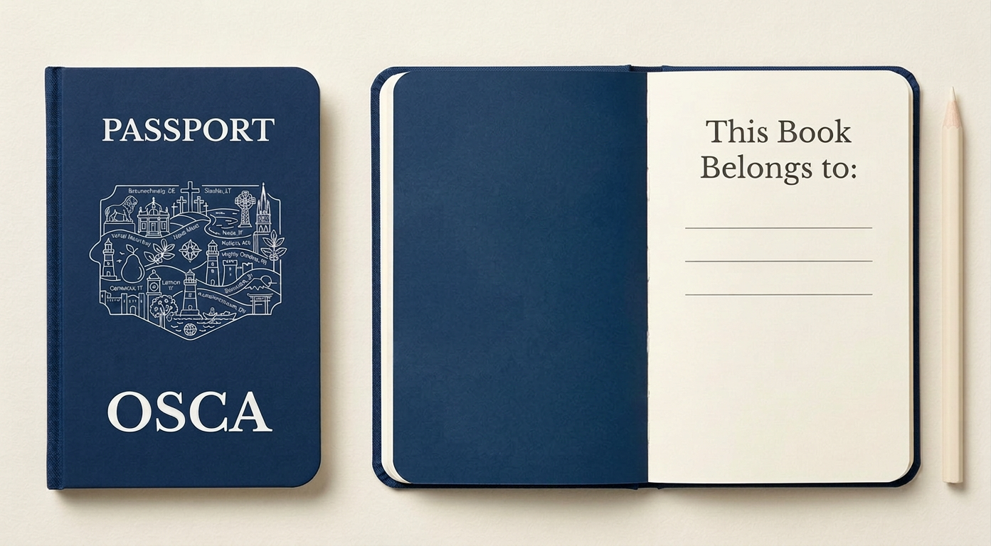
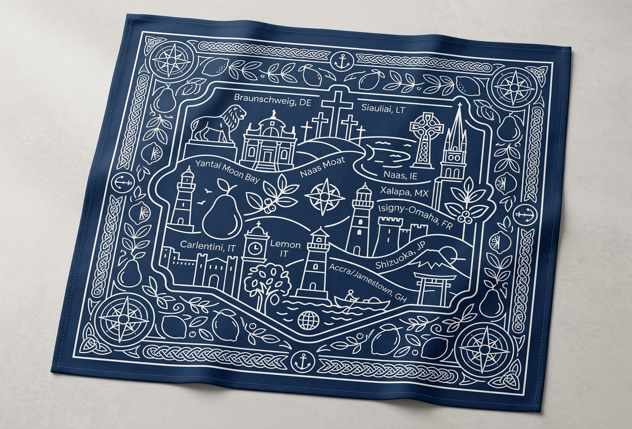
A stamp-inspired illustration system gives each of OSCA's nine partner cities its own custom mark — playful, travel-coded references to passport stamps and civic crests that bring warmth and specificity where the core graphic system stays structural. Extended into larger compositions, the same illustration language becomes keepsakes and event pieces: a passport book, a printed map, a crest that turns nine cities into one shared story.
Related Work
TEXTILE DESIGN · MATERIAL RESEARCH & DEVELOPMENT · BRAND STRATEGY & DESIGN · CURATION · PROJECT MANAGEMENT & GALLERY COORDINATION

LANDSCAPE DESIGN · MATERIAL RESEARCH & DESIGN DEVELOPMENT · SOURCING · EXPERIENCE DESIGN
CREATIVE DIRECTION · BRAND STRATEGY · BRAND IDENTITY · EXPERIENCE DESIGN · EDITORIAL DESIGN
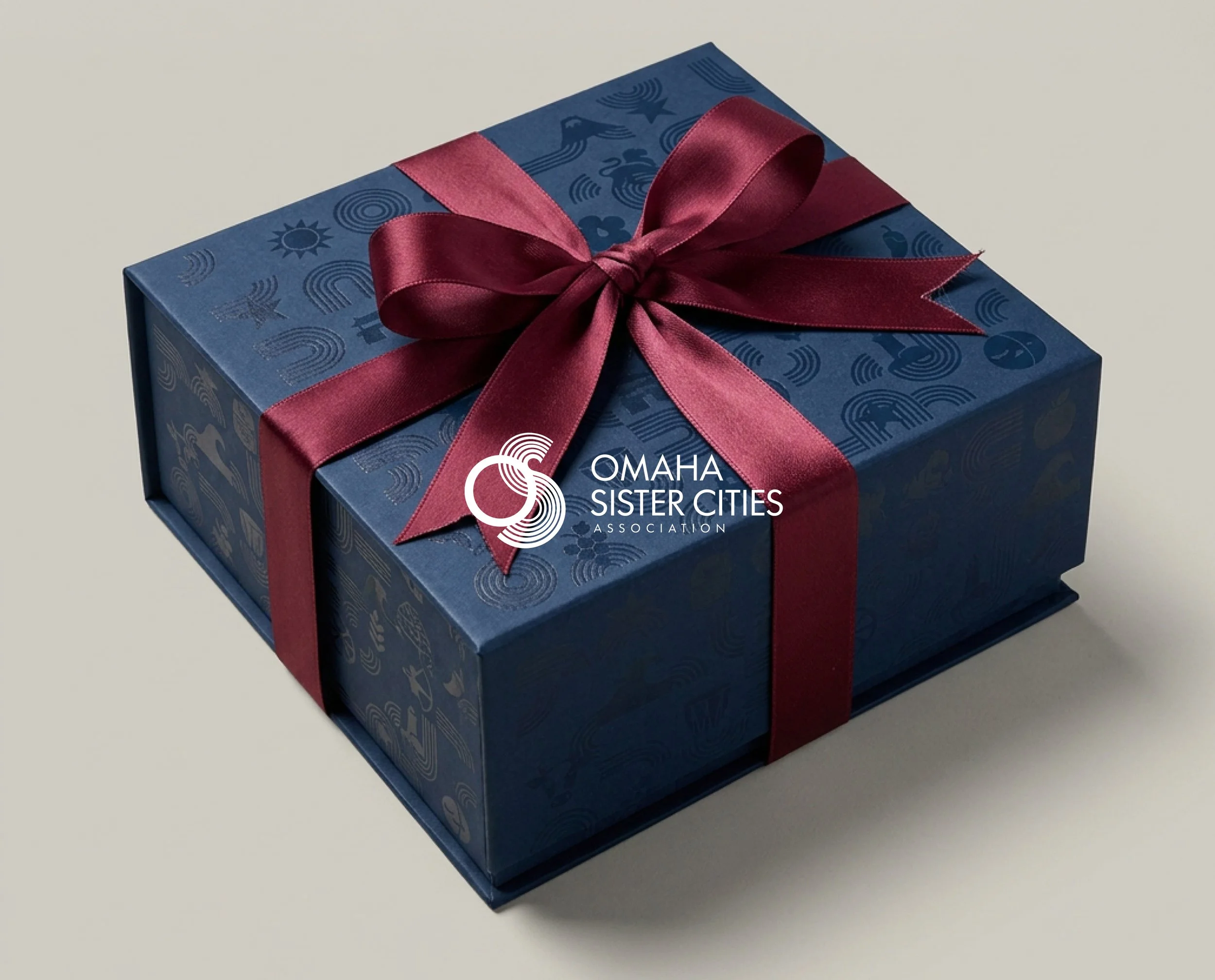
BRAND STRATEGY · BRAND GUIDELINES · VISUAL SYSTEM DESIGN · ART DIRECTION